Columnar Wavefields
Inspiration from AI Generated Art
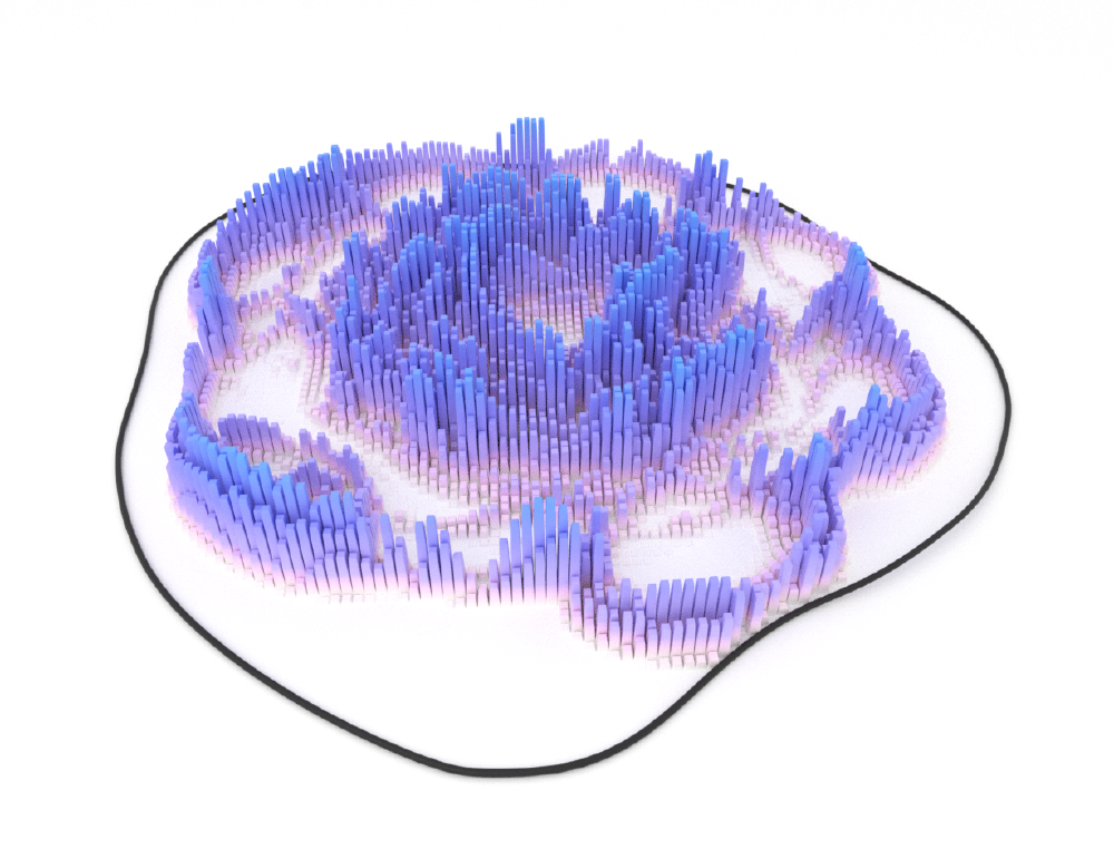
With the emergence of a wide variety of AI-based art generation tools, one particular theme I’ve noticed are these smoothly varying, voxelized topographic maps. So something kind of in this direction:

The above image is actually rendered in Blender — not with an AI tool. Here I just used some random noise to set the relative heights of each column and then added a smooth falloff towards the edge of the plane.
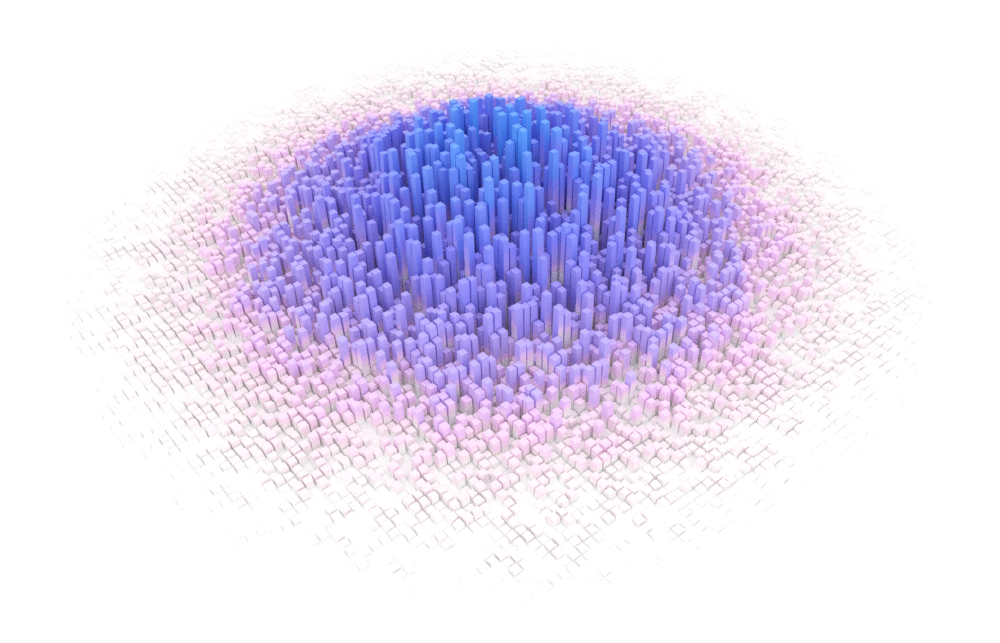
I thought this style of visualization could be pretty cool for representing the propagation of an acoustic wavefield through a medium. Will it provide a lot of value from a scientific standpoint? Probably not. But I think it does a nice job at capturing the imagination 🙂
Here’s a list of tools I used to generate the animations in this article:
- Coreform Cubit
- Constructing the finite-element mesh.
- Salvus
- Acoustic wave simulation.
- Blender
- Rendering of the animations.
Generating the Sound Wavefield
The example over on the wave simulations page which depicts a wavefield propagating through a three-layered blob does quite a nice job at showcasing many different wave phenomena. It’s a pretty simple example, but it captures a lot of the features which make the wave equation so interesting (and beautiful) — reflections, the bending of the waves across interfaces, changes in the wavelengths depending on the medium’s speed-of-sound… and the list goes on.
Here’s the wavefield we’re going to be considering in this article:
Using Displacement Maps
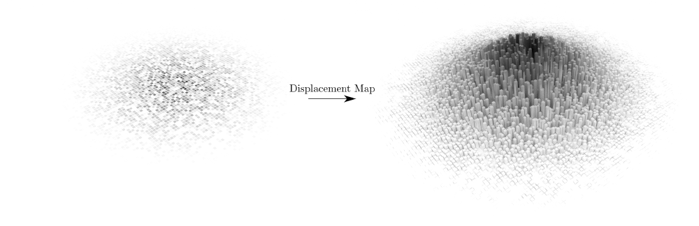
A displacement map in computer graphics is a tool that deforms the surface of a mesh using some kind of image texture. This is an extremely powerful tool for baking information from an image into the geometry of the model with very minimal effort.

Note that a displacement map is different from something like a normal map or a bump map, which are also commonly used to achieve similar effects. The most notable difference here is that displacement maps actually deform the surface of the mesh whereas normal and bump maps merely influence how the lighting interacts with the surface of the mesh. The reason why we want to use a displacement map here is that the deformations we’re going to be applying to our surface will be pretty strong (i.e. the height of each of these columns). This is the kind of situation where displacement maps really shine.
Preparing the 2D Wavefield Images
Since we’re going to be applying displacement maps to represent the wavefield deforming a plane, we need to have some series of 2D images that we can use to apply these deformations.
Let’s start by rendering out a smoothed version of the wavefield. Since we used the spectral-element method to compute the acoustic wavefield, we need to interpolate our wavefield results from the finite-element mesh onto a regular grid.
Here’s what this wavefield looks like:
The above wavefield animation was made by plotting the individual wavefield
snapshots with matplotlib and then saving each frame as a separate .png
image. Really nothing fancy.
Setting up the Animation in Blender
Before splitting the wavefield into a series of discrete columns, I wanted to make sure that I had things set up correctly with the displacement maps in Blender.
The setup here is pretty simple — I placed a plane in the center of the scene and applied an animated image texture to it. This animated image texture serves two purposes:
- Displace the plane in the \(z\)-direction so that the wavefield would be physically deforming the plane based on the amplitude of the waves, and
- Colour the columns based on the amplitudes of the waves.
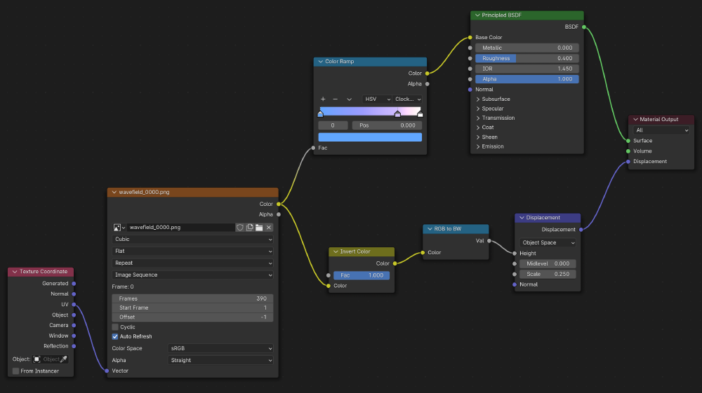
Using Blender’s built-in shader editor, I set up the following node tree to achieve this:

The image texture is mapped to the plane’s UV projection to provide a greater amount of control over where the texture appears on the plane. I added a splash of colour here using a simple colour ramp node. This was also why I exported the initial animation in grayscale — then I don’t need to re-export the entire animation each time I want to adjust the colours. This is fed into a standard principled BSDF (bidirectional scattering distribution function) to create a relatively diffuse material. The displacement map is applied in the normal direction to the plane and is scaled proportionally to the same image texture which populates the colour on the plane.
Note that using something like a Subdivision Surface modifier is required to
provide the plane with sufficient virtual geometry to be able to deform
the plane smoothly using the displacement map.
A pretty easy way to add a bit of camera movement here is to place an
Empty (or any other piece of geometry that won’t appear in the render) in the
center of the domain, which the camera tracks (using the Track To
constraint). The position of the camera is then tied to a NURBS curve
(using the Follow Path constraint) so that the camera traverses the entire
length of the curve throughout the animation. The result is that the camera
always remains focused on the center of the plane due to the Track To
constraint, while also smoothly following the curve.
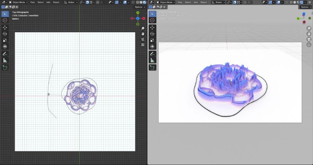
Here’s what this setup looks like in the viewport:

The resulting animation, once rendered out, then looks like this:
Discretizing the Wavefield into Columns
I wanted to make the discretization quite coarse here so that the columns are clearly apparent within the wavefield. However, I also wanted there to be clear gaps between the wavefield columns so that Blender’s ray tracer could do its thing with adding some shadows between the individual columns. The point of incorporating these shadows is that they help to convey a sense of depth to the viewer.
Here’s what the coarse wavefield looks like:
Assuming that the wavefield is already on a fairly coarsely sampled grid
(here I used a grid with dimensions [100, 100]), I resampled this again
back onto a finer grid where I duplicated the values surrounding each pixel.
I achieved this using something like this:
# Iterate over every time slice
for i in range(nt):
    # Duplicate the time slice we want to resample
    temp = data[i, :, :]

    # Upsample the time slice by duplicating its surrounding pixels
    for j in range(2):
        temp = np.repeat(temp, resampling_factor, axis=j)

    # Save the resampled data
    data_resampled[i, :, :] = temp
The resampled dataset versus the initial one are visually indistinguishable at this point. However, the point of performing this resampling is that one can then set every \(n^\text{th}\) pixel to zero to add a clean separation between neighbouring columns in the wavefield.
Here’s what the resulting wavefield looks like:
Rendering Everything in Blender
Now that we have everything set up, we can go ahead and render everything in Blender.
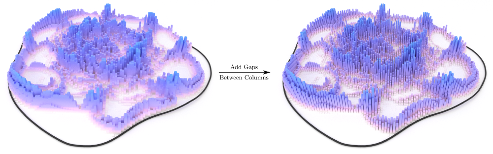
Before we render out the entire animation, let’s double check that everything is looking as expected. As a proof-of-concept that adding this separation between adjacent columns is actually beneficial, let’s take a look at what a wavefield snapshot with and without this separation looks like:

It definitely looks like that’s doing what we want it to do. Let’s render out the entire animation now then to see what the final product looks like:
That looks pretty sweet! As I mentioned at the start — this doesn’t really add a lot of scientific value to the visualization, but it does look pretty cool.
Rendering from the Command Line
A useful tidbit of information I came across when creating this render was how one can render this on a remote workstation instead of having to render it locally.
All of the scene setup was done on my local machine (running macOS), but I then
transferred the .blend file over to a Linux workstation with a lot more
horsepower so that I could render out the animation much faster. Since this
workstation is sporting an Nvidia GPU, I could take advantage of that to render
out the animation very quickly.
Assuming that Blender is installed on the remote workstation (and that Blender is in the system path), it’s as easy as running the following from the command line:
blender -b /path/to/file.blend -E CYCLES -a -- --cycles-device CUDA
There are additional options that allow one to use both the CPU and GPU for rendering the scene, but I found that there wasn’t any appreciable computational speedup for this relatively simplistic scene. I could see this being pretty handy for more complex scenes though.
One gotcha when performing this type of remote rendering is that
linked objects (eg. textures) need to be embedded directly into the
.blend file. However, animated textures cannot be embedded into the
.blend file directly (at least as of Blender 4.1). To get around this, I used
the Blender utility which converts all absolute paths to relative
paths and then copied the animated textures to the remote while taking
care to maintain the same relative pathing.